Node-RED does not provide a user interface node specific to represent a LED in the dashboard.
This is not an issue at all since there are a few different ways to achieve this goal.
This is not an issue at all since there are a few different ways to achieve this goal.
1- Using a Text output node from the Dashboard along with an icon from Font Awesome (http://fontawesome.io/icons/)

I have used the most basic representation icon which is the fa-circle.

Simple flow to demonstrate how to configure an icon to represent a LED:

As we want the LED to change colors, normally to green or red we have to add some code to manage the color change. For this testing, I created a property in the .msg object and assigned to it a color (lime or red).
See the Javascript code inside the function node. It simply adds a color to msg.color property. If msg.payload is "ON" then msg.color will be "lime" (a light green) otherwise (for any other payload) msg.color will be "red"

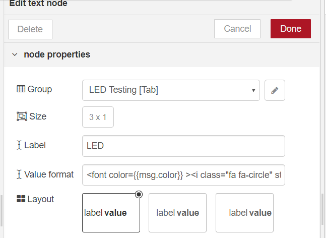
The text output node should have the following configuration in the field Value format:
<font color={{msg.color}} ><i class="fa fa-circle" style="font-size:24px;"></i></font>
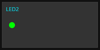
This is the end result of the dashboard.


Flow :
[{"id":"17ca9b9e.d2a564","type":"function","z":"3fc1de78.729e82","name":"Test","func":"msg.color = (msg.payload === \"ON\")?\"lime\":\"red\";\nreturn msg;","outputs":1,"noerr":0,"x":330,"y":200,"wires":[["872b1d71.45076"]]},{"id":"c6ac5bac.e91e38","type":"inject","z":"3fc1de78.729e82","name":"","topic":"","payload":"ON","payloadType":"str","repeat":"","crontab":"","once":false,"x":170,"y":180,"wires":[["17ca9b9e.d2a564"]]},{"id":"872b1d71.45076","type":"ui_text","z":"3fc1de78.729e82","group":"a6e358b.672ffa8","order":3,"width":"3","height":"1","name":"","label":"LED","format":"<font color={{msg.color}} ><i class=\"fa fa-circle\" style=\"font-size:24px;\"></i></font>","layout":"row-left","x":510,"y":200,"wires":[]},{"id":"9d39dfc1.aff32","type":"inject","z":"3fc1de78.729e82","name":"","topic":"","payload":"OFF","payloadType":"str","repeat":"","crontab":"","once":false,"x":170,"y":220,"wires":[["17ca9b9e.d2a564"]]},{"id":"a6e358b.672ffa8","type":"ui_group","z":"","name":"LED Testing","tab":"4e528085.a1bfa","disp":true,"width":"4"},{"id":"4e528085.a1bfa","type":"ui_tab","name":"Tab","icon":"dashboard","order":0}]
2- Using a template node from the Dashboard along with very simple SVG directives

Following code, with SVG directives, must be added to the Template field in the configuration dialog page from the node.
<svg width="100" height="80">
<circle id="circle1" cx="20" cy="20" r="10"
style="stroke: none; fill: {{msg.color}};"/>
</svg>
Alternatively, instead of writing the parameters stroke and fill inside the SVG tags it is possible (and many times desirable) to use the CSS way of working. We do that using an additional pair of tags <style></style> and write those parameters as property : value; in each line. The hashtag #circle1 defines the style parameters for the HTML element with id = "circle1".
<style>
#circle1 {
stroke: none;
fill: {{msg.color}};
}
</style>
<svg>
<circle id="circle1" cx="10" cy="20" r="10"/>
</svg>


<svg width="100" height="80">
<circle id="circle1" cx="20" cy="20" r="10" stroke={{msg.color}} fill="transparent" stroke-width="5"/>
</svg>

Flow :
[{"id":"17ca9b9e.d2a564","type":"function","z":"3fc1de78.729e82","name":"Test","func":"msg.color = (msg.payload === \"ON\")?\"lime\":\"red\";\nreturn msg;","outputs":1,"noerr":0,"x":330,"y":200,"wires":[["872b1d71.45076"]]},{"id":"c6ac5bac.e91e38","type":"inject","z":"3fc1de78.729e82","name":"","topic":"","payload":"ON","payloadType":"str","repeat":"","crontab":"","once":false,"x":170,"y":180,"wires":[["17ca9b9e.d2a564"]]},{"id":"872b1d71.45076","type":"ui_text","z":"3fc1de78.729e82","group":"a6e358b.672ffa8","order":3,"width":"3","height":"1","name":"","label":"LED","format":"<font color={{msg.color}} ><i class=\"fa fa-circle\" style=\"font-size:24px;\"></i></font>","layout":"row-left","x":510,"y":200,"wires":[]},{"id":"9d39dfc1.aff32","type":"inject","z":"3fc1de78.729e82","name":"","topic":"","payload":"OFF","payloadType":"str","repeat":"","crontab":"","once":false,"x":170,"y":220,"wires":[["17ca9b9e.d2a564"]]},{"id":"a6e358b.672ffa8","type":"ui_group","z":"","name":"LED Testing","tab":"4e528085.a1bfa","disp":true,"width":"4"},{"id":"4e528085.a1bfa","type":"ui_tab","name":"Tab","icon":"dashboard","order":0}]
2- Using a template node from the Dashboard along with very simple SVG directives

Following code, with SVG directives, must be added to the Template field in the configuration dialog page from the node.
<svg width="100" height="80">
<circle id="circle1" cx="20" cy="20" r="10"
style="stroke: none; fill: {{msg.color}};"/>
</svg>
Alternatively, instead of writing the parameters stroke and fill inside the SVG tags it is possible (and many times desirable) to use the CSS way of working. We do that using an additional pair of tags <style></style> and write those parameters as property : value; in each line. The hashtag #circle1 defines the style parameters for the HTML element with id = "circle1".
<style>
#circle1 {
stroke: none;
fill: {{msg.color}};
}
</style>
<svg>
<circle id="circle1" cx="10" cy="20" r="10"/>
</svg>

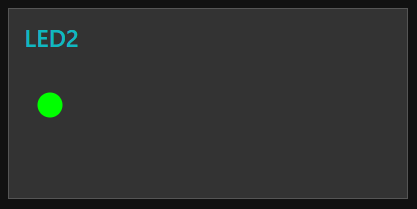
This is the result we get on the dashboard:

Below a variation on the LED design:
<svg width="100" height="80">
<circle id="circle1" cx="20" cy="20" r="10" stroke={{msg.color}} fill="transparent" stroke-width="5"/>
</svg>


3 comments:
Great tutorial. I'm using as an indicator for garage door status. (Open=red, closed =green.
Nice workaround. Is there a way to use it with a switch with true msg
Post a Comment